


✨ Project Spotlight: Bunker | An army-themed bar with a twist
Break from the norm


Bunker is a subterranean bar in a multi-family community.
How do you combine a former Salvation Army building, a below-ground space, and a destination-worthy bar concept?
We built Bunker — a satirical take on the army, with a nod to the unique physical set up. Serious vs. not-so-serious.
We designed the wordmark to illuminate the fact that we fight for peace: an arching bunker over a warped peace sign.
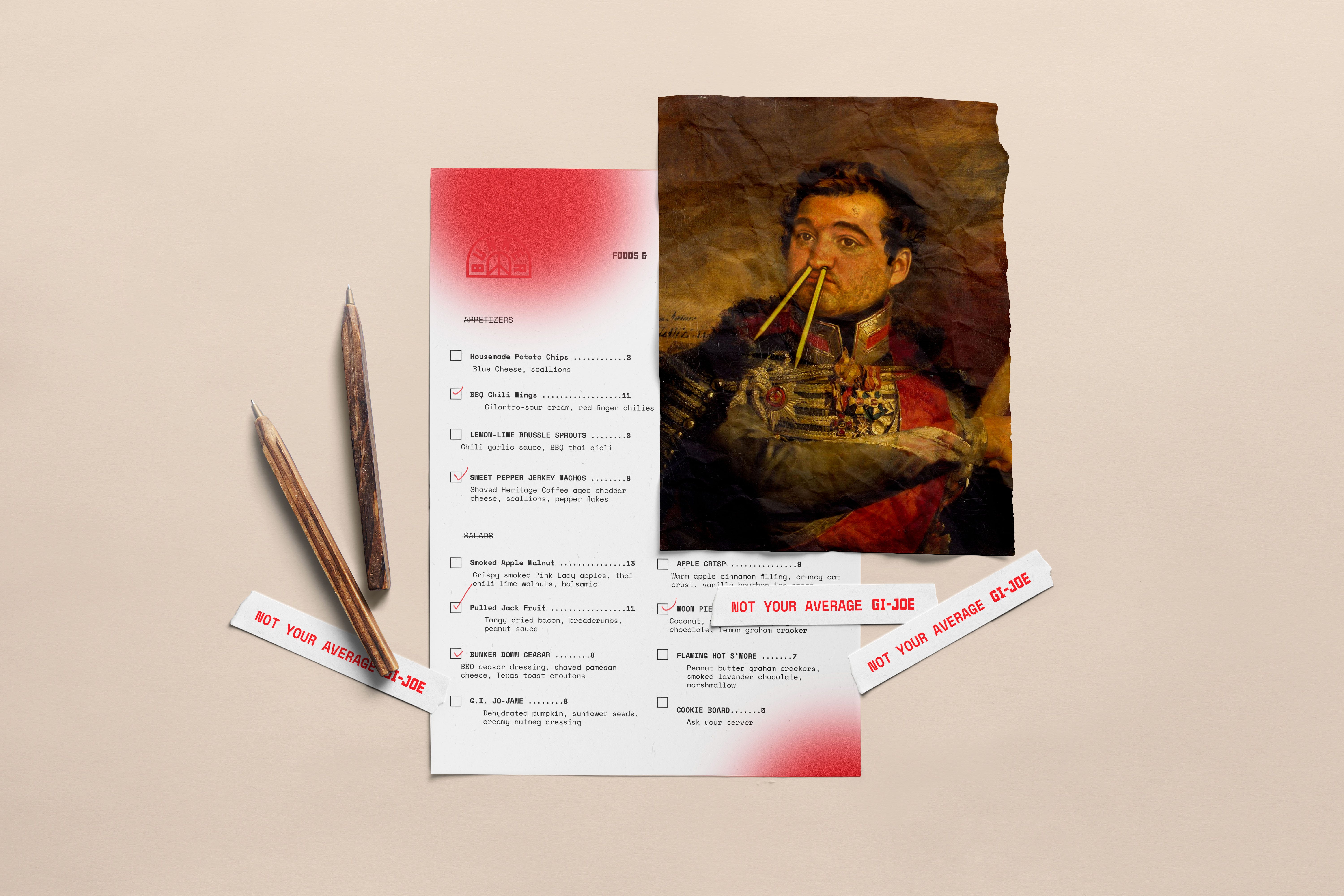
We crafted the experience to make the space appropriately thought-provoking: old-school captain uniforms with local Chicago heroes, candy cigarettes, themed playing cards, and branded flasks.
The result? A bar that stands out from the rest and fits in perfectly with the creative community.
🏁 FOCUS
Brand Design, Print Collateral


THE BUNKER IDENTITY IS PART SATIRE, PART WAR TIME IMAGERY, AND A LOT OF REFERENCE TO THE PHYSICAL SPACE. BUNKER IS A SATIRCAL TAKE ON WAR. A PROVOCATIVE, SOMETIMES HUMOROUS MIX OF DEPENDABLE AND WILDCARD.
A provocative, sometimes humorous mix of dependable and wildcard. Some fluff, all flavor. A funky take on army iconography.
Not your average GI-Joe or GI-Jane. The brand breaks through the mid-century noise by modifying American traditional photography, typography, and symbols.
FROTH’s older sister and brother. The Good Ole’ American, with a slice of rebel. Bunker embodies common cultural soldier codes, with pops of shock.


🚨 WHO IS NO WALLS STUDIO (AND WHAT DO WE DO)?
No Walls Studio is a design and brand consultancy that helps placemakers create spaces that people love.
Our mission is to make sameness extinct in real estate, which means that everything we do comes with new ideas and unique angles — all, grounded in a deep understanding of culture and consumers.
We do three things for our clients (often, all in the same project):
Research
Brand Development
Spatial Experience Design
Want to work with us or learn more?
👉 Reach out to us. 📧

